£1

We've launched the Experience Kit version 1
Go to the Experience Kit for React.
Components
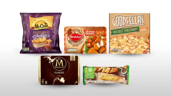
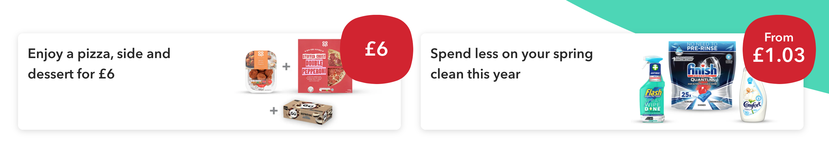
Use feature cards to highlight a deal or that something new has been added to the website. Feature cards link to a page with more information.
A feature card highlighting a ‘£1’ deal.
The title should:
The image must relate to the content.
It must have an alt tag that describes the image content. For more information, go to the accessibility standard for alternative text.
If you are creating a feature card in our content management system Contentful, you should upload a 780px (width) × 438px (height) image. Contentful will then generate and add the required image sizes.
If you are creating a feature card using the code, consider image quality across both retina and non-retina devices.
The feature card should use one of the squircle options to highlight either a category, price or price reduction.
Some of the squircle options you can use.
You should not use more than 3 feature cards in a row. You should lay these out using the grid.
The grid will help you to set the number of columns the feature card is displayed over for different screen sizes.
If you’re creating the feature card in Contentful, you’ll be able to choose from a range of layout options.
You can choose a horizontal format that allows 2 cards to sit across the page.
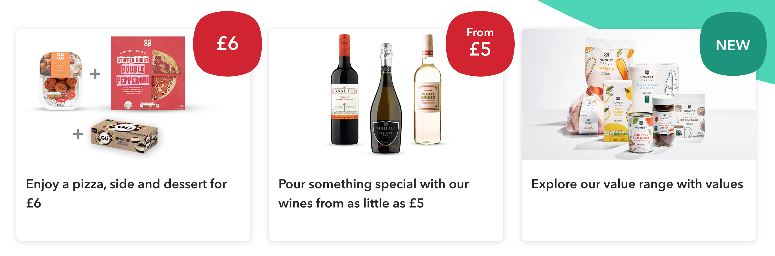
A row of 3 feature cards using the standard format.
A row of 2 feature cards using the horizontal format.
| Date | Notes |
|---|---|
| 14 April 2021 | First version of page published |
| 12 January 2023 | Fixed broken image references |