We've launched the Experience Kit version 1
Go to the Experience Kit for React.
Components
Signpost navigation
Signposts allow you to create links to permanent content you think people are looking for.
Example
A basic signpost.
Required elements
Link
Link text should:
- be between one and 4 words in length
- be actionable
- make it clear where the link will take the user
Keeping the line length short helps people to find what they want and stops the size of the card/button becoming too big.
Optional elements
Image
The image must relate to the content.
It must have an alt tag that describes the image content. For more information, go to the accessibility standard for alternative text.
If you are creating a signpost in our content management system Contentful, you should upload a 780px (width) × 438px (height) image. Contentful will then generate and add the required image sizes.
If you are creating a signpost using the code, consider image quality across both retina and non-retina devices.
Example

Signpost with image.
Using signpost navigation on a page
You can build a simple list of links or sub navigation by grouping signposts together. This can be useful if you need to provide several links on a particular theme.
Group signposts in horizontal columns of 2 to 4 using the grid. The grid helps to adapt the number of columns displayed over different screen sizes.
Do not use more than 2 rows of signposts in a group.
Example
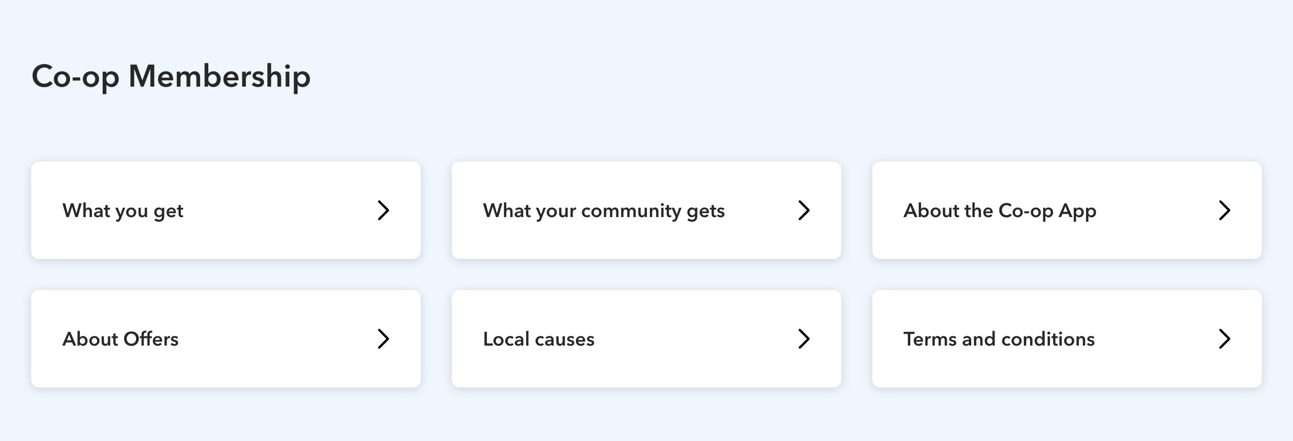
6 signposts displayed over 3 columns and 2 rows.
Changelog for this page
| Date | Notes |
|---|---|
| 14 April 2021 | First version of page published |