We've launched the Experience Kit version 1
Go to the Experience Kit for React.
Components
Skip navigation
Skip navigation allows screen reader and keyboard users to go directly to the main content.
Example
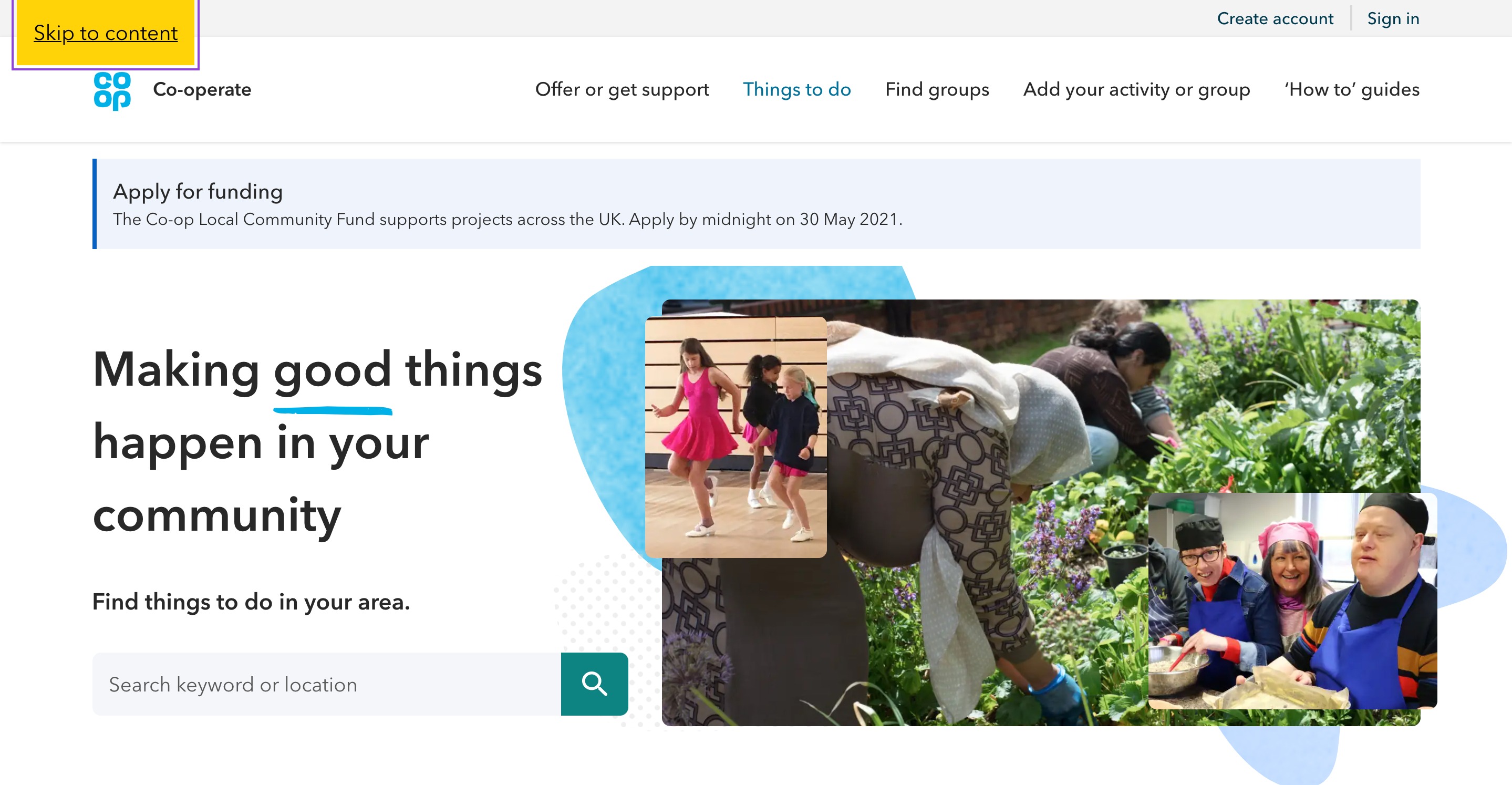
Skip to content link focused after the tab key has been pressed.
Required elements
Links
Links within the skip navigation component should take the user directly to the main areas of the page. These are usually the:
- navigation
- main content
- footer
Using skip navigation on a page
The skip navigation function should be the first thing that appears on a page when it has loaded and a user presses the tab key.
Pressing the tab key again should then cycle through ‘skip to content’, ‘skip to navigation’ and ‘skip to footer’ links.
Pressing enter will take the user to the correct part of the page and apply the focus ring to the first interactive element in that section.
If the user tabs through the skip navigation without selecting an option the Co‑op logo should be the next element that has the focus ring applied.
Changelog for this page
| Date | Notes |
|---|---|
| 14 April 2021 | First version of page published |