We've launched the Experience Kit version 1
Go to the Experience Kit for React.
Forms
Form design
Consistent and best practice form design makes our products intuitive. This means people can focus on their task without learning how a Co-op product works every time they use one.
Elements of a form
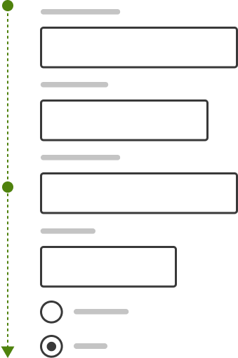
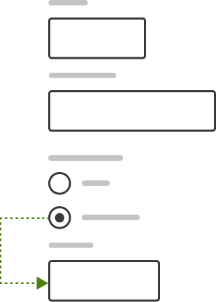
Forms can be made up of a range of elements. The diagram shows some of these elements.
Example

The parts of a form are the:
- Form validation.
- Label.
- Select dropdown.
- Field icon.
- Hint text.
- Input field.
- Optional field label.
- Focus ring.
- Radio button.
- Inline validation message.
- Error field styling.
- Text link.
- Checkbox.
- Primary button.
Layout and hierarchy
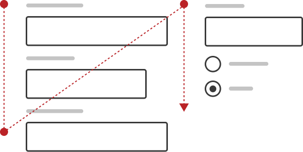
Use a single column layout for forms
This allows the user to focus on one field at a time, making it easier for them to complete their task.
When form fields are in multiple columns, users have to scan across the page to understand the content. If they use a screen magnifier to zoom into the page they might not see some of the fields.
When each row of the form contains multiple elements it is harder to know what to fill in first, and the way to complete the form becomes unclear.
Single column form
User attention flows in a single direction.
Multi-column form
User attention flows in multiple and competing directions.
Grouping, structure and flow
Group related information
The flow from one set of questions to the next should have a natural progression from one topic to another. Grouping related fields helps with this and allows users to make sense of the information they need to fill in.
Sequence information logically
Display form fields in a logical sequence to reduce cognitive effort.
Sequence fields based on patterns that are natural for users or that reflect real things such as a credit card.
For example, for a credit card form, you should always start with the card number and end with the security code. This because it follows the layout on the real card and because whenever people enter credit card information this is the order they do it in.
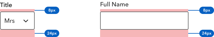
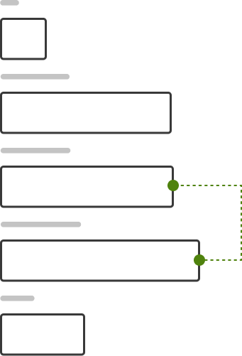
Default spacing
Our form elements and components come with default padding. This example shows how these defaults apply to different form elements.
Example
Do not use long forms
Lengthy forms can cause many usability issues, including overwhelming users. When you need to use a long form, there are
design patterns which can help them feel less overwhelming.
Sometimes, lengthy forms are unavoidable. In these situations, consider using some of the following patterns.
Multistep forms
Multistep forms are made up of multiple pages, with fields spread across pages. A multistep form can include a progress indicator to help users understand the different steps within a form.
When dividing a form into multiple pages, make sure that the content on each page is grouped. If 'Personal details' is the first step on a form, that page should contain all the questions relating to personal details.
Progressive disclosure
Progressive disclosure is a pattern through which content is revealed gradually to the user. Content is usually revealed as the user fills in specific parts of the form. This can help forms feel shorter, with more fields only appearing when relevant.
On page load, fewer fields are displayed on screen.
As the user interacts with the form, additional fields are displayed.
Labels and input fields
Labels
Always put the label above the field. This helps create a clear relationship between the label and input field. They also make the form easier to scan, which helps improve understanding.
Give labels their own row. This allows the length to vary, without impacting the position of the field.
Input fields
Input width
Use a text input that is appropriate for the amount of information someone needs to enter. While it may be tempting to make all text input fields the same width for a more uniform interface, it can lead to usability issues. Too wide and it might intimidate or confuse, too narrow and it might frustrate.
The width of the text input can act as a guide to the user for how much information is expected. This can help improve completion rate of a form.
Preferred: Varying input widths help the user understand how much information is required in each field.
Avoid: Consistent input widths require more effort from the user to understand input requirements.
Optional and required fields
Only highlight optional fields on a form, not the mandatory or required fields. Optional fields also should not have any validation rules applied to them.
To see how to style an optional field, go to the form elements
Fieldset spacing
Forms vary in length and complexity. Consider what spacing is appropriate for your fieldsets. Think about spacing when moving from larger to smaller screens.
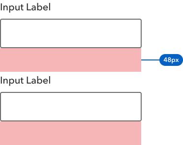
As well as our default spacing units, we also have CSS classes that allow you to experiment with variations of spacing. You can multiply the 2px, 4px, 8px, 16px, 32px or 64px by either 1.5 or 2 and use these values for spacing field sets.
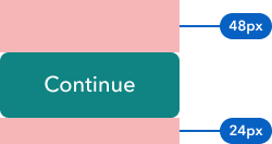
For example, if your form requires a large vertical space, you can multiply the 32px unit by 1.5. The will give you a vertical spacing of 48px.
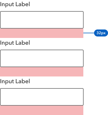
Vertical spacing of 24px
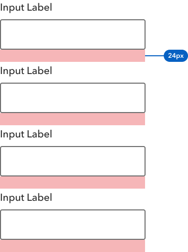
Vertical spacing of 32px
Vertical spacing of 48px
Buttons
Alignment
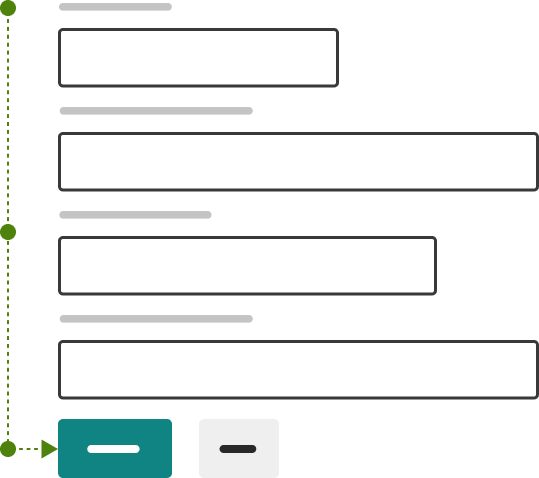
Buttons that perform the main action on a form (such as submit) should always be left aligned to the edge of the input fields.
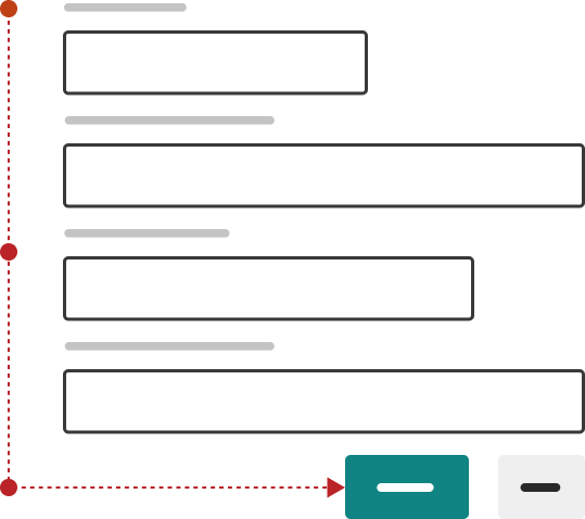
Left aligning buttons and inputs makes the path to completion clearer. Aligning buttons to the right, or using a mix of right and left alignment can lead to usability issues. People might not see the buttons to the right, particularly if they use a screen magnifier to zoom the screen.
If you need more buttons, place them next to the primary action button, aligned left. For keyboard users, this means that the tabbing sequence will always select the primary action button before selecting any others.
Preferred: Left aligned buttons make the path to completion clear.
Avoid: Right aligned buttons make the user shift focus from left to right and might be missed.
The button is still visible even when the user is zoomed into the screen.

The button is not visible when the user is zoomed into the screen.

Visual hierarchy
Place buttons in a logical order. A clear visual hierarchy between buttons on the same screen is important as it can help users identify the primary action easily.
Avoid having buttons of the same prominence next to each other. It can create confusion and force the user to question which action is the primary one.
Button width
The width of the button should be determined by the content inside it. Avoid making buttons full width (especially on larger screens) as they stop looking like buttons and can confuse users.
This is important for screen magnifier users, as the primary button content can be found without having to pan to the right. This ensures the product or service is accessible.
Disabled buttons
Do not use disabled buttons on forms. Allow the user full access to all actions, even if that means the user fails and has to take an action to remedy the problem.
Navigation buttons
Placing these buttons at the bottom of a form takes prominence away from more important buttons, and creates confusion for screen reader and keyboard users.
Button spacing
It's important to use space around the primary button to help give it prominence on the screen. Use larger vertical spacing between the last field set and primary button.
Example
Which button styles to use
| Form button type | Description | Examples | Styling |
|---|---|---|---|
| Primary | Submits the form and takes the user to the next part of the journey | Confirm, Submit form, Place order, Next page | Primary Button Green |
| Secondary | Make a change within a form | Apply offer code, save and exit, Add another guardian | TBC |
| Related | Starts a journey related to the form being completed | Forgotten password, Privacy policy | Text link |
| Cancel | Cancels the progress made with the a form | Cancel, Delete, Remove | Text link |
| Navigation | Navigates the user away from the form | Back, Previous | TBC |
Changelog for this page
| Date | Notes |
|---|---|
| 9 June 2022 | First version of page published |
| 20 January 2023 | Minor content updates |