We've launched the Experience Kit version 1
Go to the Experience Kit for React.
Foundations
Colours
The colours we use for digital channels are based on our brand palette. We use guidelines for colours to make sure they meet accessibility guidelines.
Using colours from our colour palette creates a consistent experience for our users.
Accessibility
All colours in our palette have been tested for accessibility.
Each colour on this page has:
- a link to the contrast test for that colour
- been tested in combination with a colour it most commonly appears with
If you want to create colour combinations, test the colour contrast ratio to make sure it is accessible at a minimum ratio of 4.5.1.
Primary palette
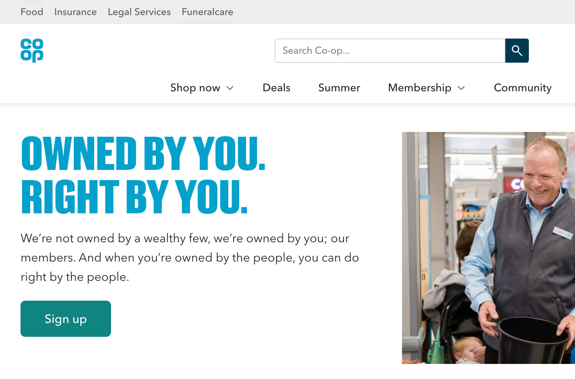
Our Primary palette consists of white and Co-op blue. These are the main colours that flow through all of Co-op’s communications.
| Preview | Colour name | Hex value | Variable name | Colour contrast |
|---|---|---|---|---|
| Co-op blue | #00A1CC | --color-brand |
WCAG AA (large text) Co-op blue on white |
|
| White | #FFFFFF | --color-white |
WCAG AAA Text on white |
Co-op blue
Only use 'Co-op blue', for the:
- brand logo
- Co-op headline font
- backgrounds with the Co-op headline font in white
- background of app icons
- Member Prices
Co-op blue meets the colour contrast guidelines when it's over 19 pixels (WCAG AA large text). You must only use the Co-op headline font at sizes larger than 19px.
Go to information about using the Co-op headline font
Go to information about using Co-op headline font sizes
White
'White', is used:
- as our primary background colour (when a device is not using dark mode)
- for text on dark backgrounds - like buttons
- for button backgrounds on tertiary colours
Examples


Secondary palette
Our secondary palette is used for text and designed to contrast with our primary and tertiary palettes.
Use:
- 'Navy', for heading text
- 'Black', for text on background colours where Text (#282828) does not have enough contrast
- 'Text', for headings and body text in Avenir
- 'Secondary text', for hints that appear under labels in forms
| Preview | Colour name | Hex value | Variable name | Colour contrast |
|---|---|---|---|---|
| Offer red text | #D12430 | --color-offer-red-text |
WCAG AA (normal text) Offer red text on white |
|
| Offer red background | #EC1A37 | --color-offer-red-background |
WCAG AA (large text and UI) White on offer red background |
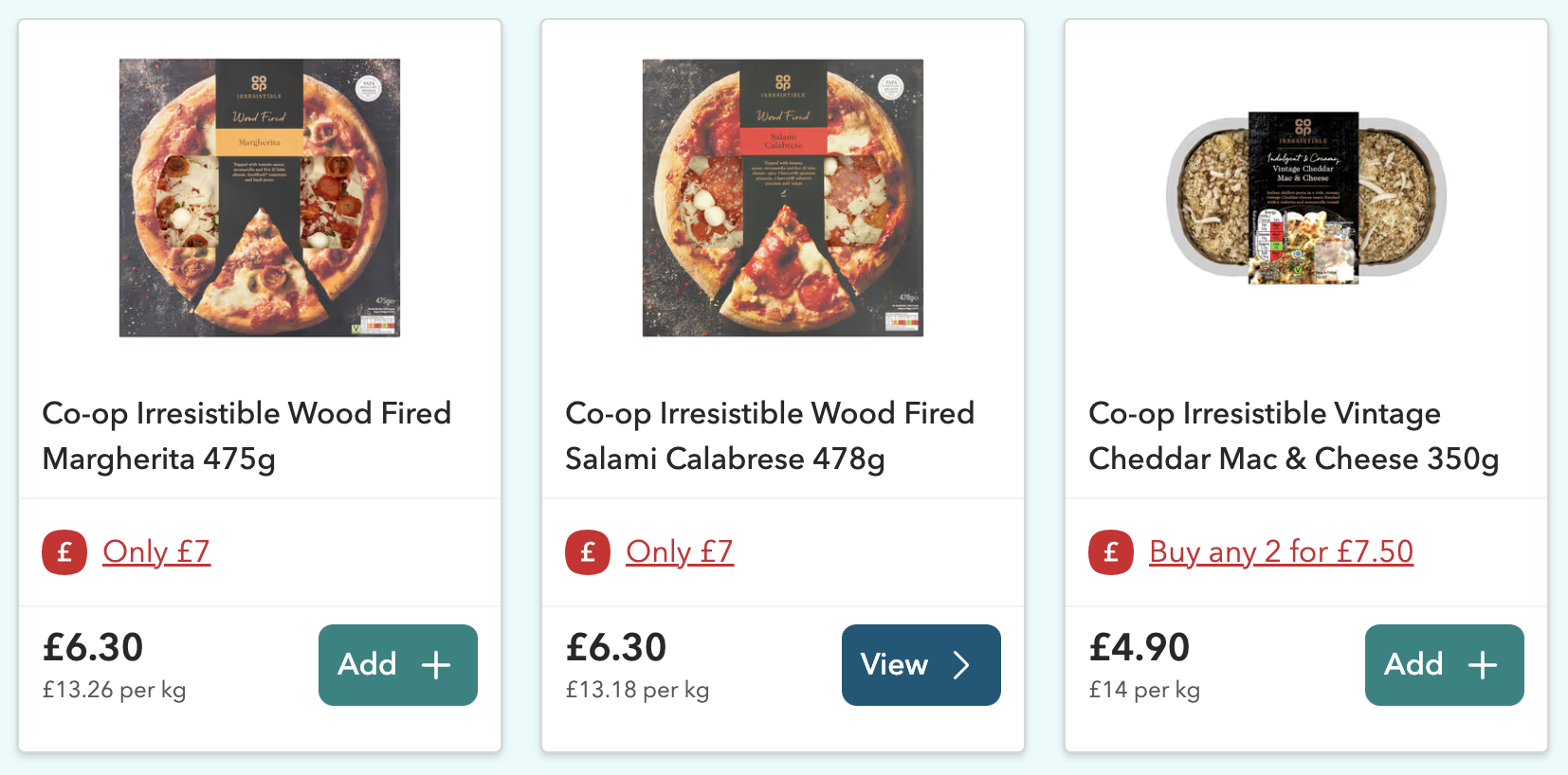
Use the offer reds where offers and discounts need to be highlighted.
Use:
- 'Offer red text', for content relating to price reductions or offers
- 'Offer red background', for squircles
Example
Tertiary palette
Use mostly white and Co-op blue with accents of tertiary colour. We bring the warmth and depth to our identity with the tertiary palette, which features dark, light and tinted tones.
The tertiary colour palette helps us give personality to our products, but also serves a functional purpose in the way we design.
Use:
- white or a neutral colour tint when designing a large background area
- warm or cool colours to make a product seem more friendly
- muted colours to give a more functional feel
- tertiary colours to give emphasis to particular content areas
- give the impression of depth and layering — this can help structure content in a way that’s helpful to users
- evoke different moods and feelings, like calm or excitement
- create a greater sense of identity for a product or service
Do not:
- put a form on a brightly coloured background
| Preview | Colour name | Hex value | Variable name | Colour contrast |
|---|---|---|---|---|
| Dark purple | #C164C9 | --color-dark-purple |
WCAG AA (large text and UI) White on offer red background |
|
| Dark pink | #F85792 | --color-dark-pink |
WCAG AA (large text and UI) White on offer red background |
|
| Dark green | #819C00 | --color-dark-green |
WCAG AA (large text and UI) White on offer red background |
|
| Dark orange | #E85A00 | --color-dark-orange |
WCAG AA (large text and UI) White on offer red background |
|
| Dark red | #F14F57 | --color-dark-red |
WCAG AA (large text and UI) White on offer red background |
|
| Dark yellow | #C08A00 | --color-dark-yellow |
WCAG AA (large text and UI) White on offer red background |
|
| Dark lilac | #6762F9 | --color-dark-lilac |
WCAG AA (large text and UI) White on offer red background |
Use dark tones only for text.
We currently have no digital usage guidelines or examples for dark tones. If you are considering using dark tones or have examples to share, contact the design team on our #experience-library-support Slack channel or email experiencelibrary@coop.co.uk.
| Preview | Colour name | Hex value | Variable name | Colour contrast |
|---|---|---|---|---|
| Light purple | #F8BEFF | --color-light-purple |
WCAG AAA Navy on light purple |
|
| Light pink | #FFAECE | --color-light-pink |
WCAG AAA Navy on light pink |
|
| Light green | #E1EC54 | --color-light-green |
WCAG AAA Navy on light green |
|
| Light orange | #FFB886 | --color-light-orange |
WCAG AAA Navy on light orange |
|
| Light red | #FFB1B4 | --color-light-red |
WCAG AAA Navy on light red |
|
| Light yellow | #FFD245 | --color-light-yellow |
WCAG AAA Navy on light yellow |
|
| Light lilac | #BFBFFD | --color-light-lilac |
WCAG AAA Navy on light lilac |
|
| Light blue | #80D0E5 | --color-light-blue |
WCAG AAA Navy on light blue |
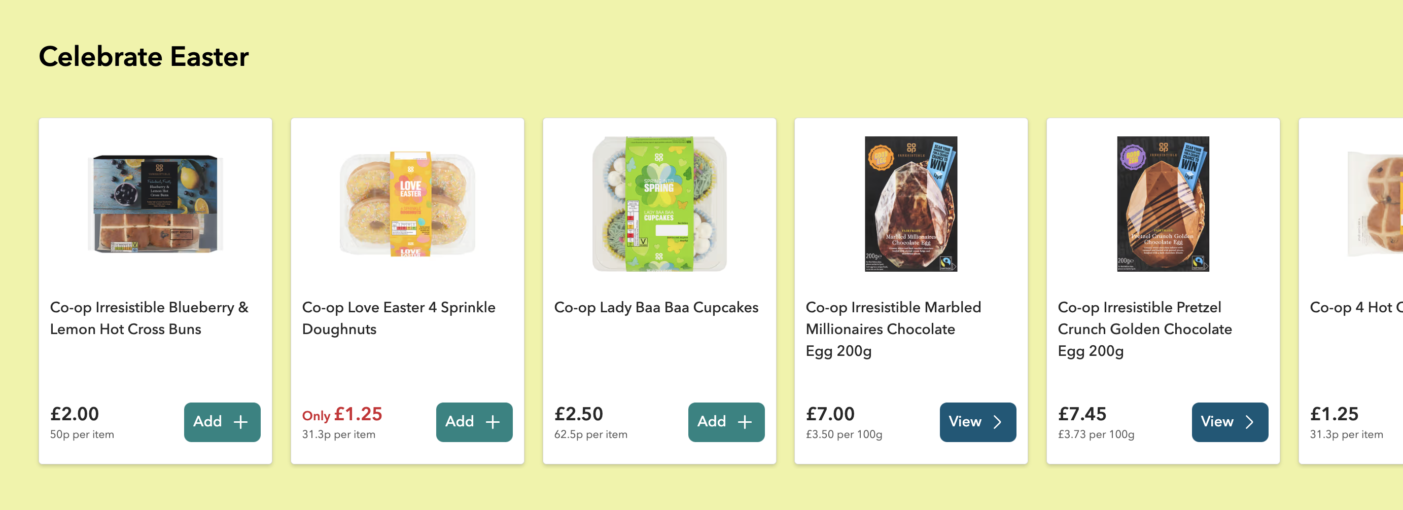
Use light tones as backgrounds to highlight content in:
- sections of a page that contain editorial cards, feature cards or signpost navigation
- tags that highlight the section of the journey the user is in
- a background to a cut out image in signpost navigation
On light tones, use:
- 'Navy', 'Black', or 'Text', colours on light tones
- black link colour
- white primary buttons
Currently digital usage guidelines for light tones is limited. If you are considering using light tones or have examples to share, contact the design team on our #experience-library-support Slack channel or email experiencelibrary@coop.co.uk.
Example
| Preview | Colour name | Hex value | Variable name | Colour contrast |
|---|---|---|---|---|
| Tint purple | #FEF2FF | --color-tint-purple |
WCAG AAA Navy on tint purple |
|
| Tint pink | #FFEAF2 | --color-tint-pink |
WCAG AAA Navy on tint pink |
|
| Tint green | #F9FBDD | --color-tint-green |
WCAG AAA Navy on tint green |
|
| Tint orange | #FFEDE0 | --color-tint-orange |
WCAG AAA Navy on tint orange |
|
| Tint red | #FFE8E9 | --color-tint-red |
WCAG AAA Navy on tint red |
|
| tint yellow | #FFF6DA | --color-tint-yellow |
WCAG AAA Navy on tint yellow |
|
| Tint lilac | #F2F2FF | --color-tint-lilac |
WCAG AAA Navy on tint lilac |
|
| Tint blue | #E6F6FA | --color-tint-blue |
WCAG AAA Navy on tint blue |
|
| Tint brown | #F5F5F0 | --color-tint-brown --color-grey-neutral-warm |
WCAG AAA Navy on tint brown |
|
| Tint grey | #F2F4F7 | --color-tint-grey --color-grey-neutral-cool-light |
WCAG AAA Navy on tint grey |
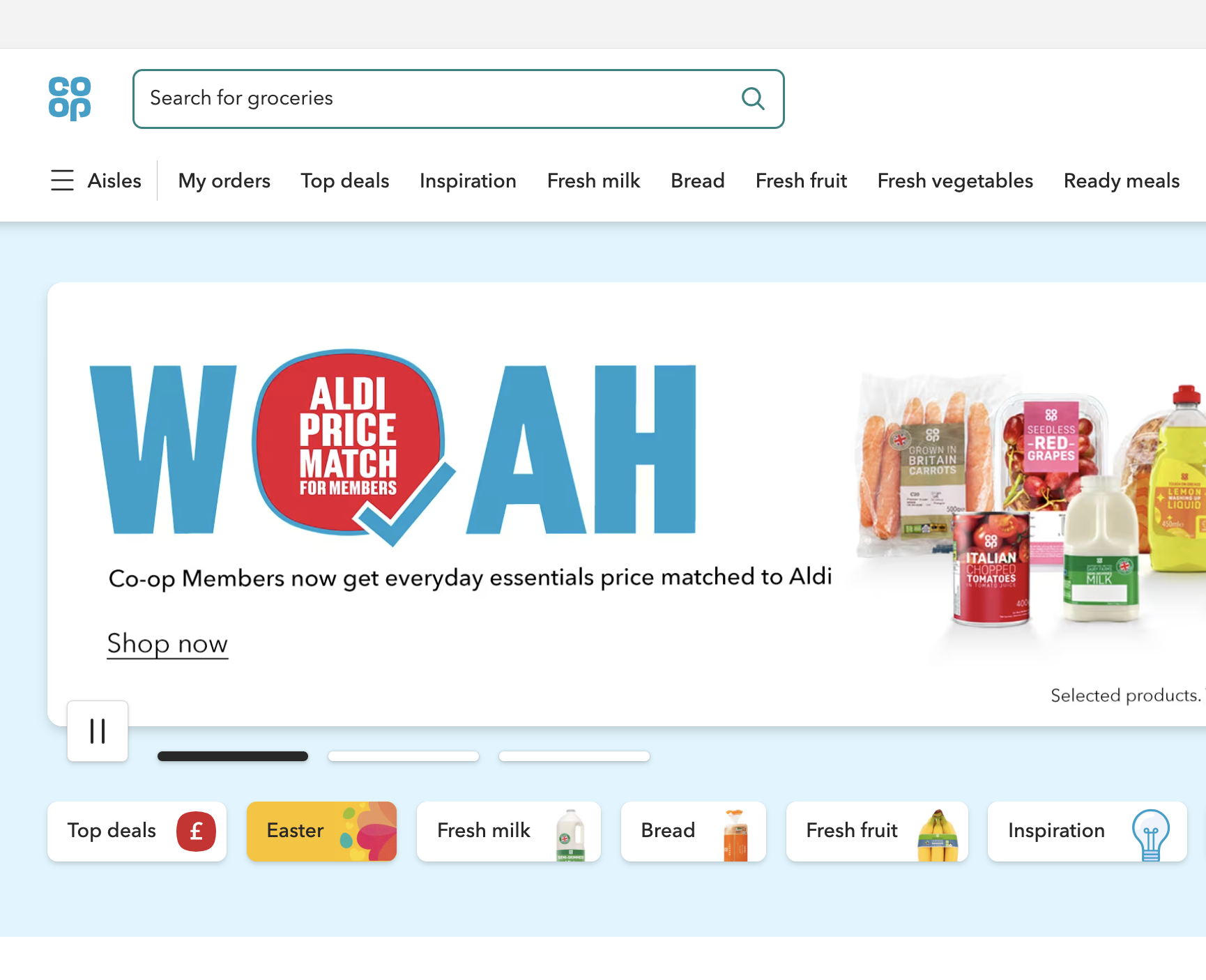
Use tints as backgrounds to highlight content in sections of a page that contain:
- editorial cards, feature cards or signpost navigation
- tags that highlight the section of the journey the user is in
- product features or secondary tasks
On tints, use:
- 'Navy', 'Black', or 'Text', colours on light tones
- black link colour
- primary and secondary green and blue buttons
Currently digital usage guidelines for tints is limited. If you are considering using tints or have examples to share, contact the design team on our #experience-library-support Slack channel or email experiencelibrary@coop.co.uk.
Examples

User interface colours
| Preview | Colour name | Hex value | Variable name | Colour contrast |
|---|---|---|---|---|
| Link | #00729A | --color-link |
WCAG AA (normal text) Link on white |
|
| Link hover | #00394E | --color-link-hover |
WCAG AAA Link hover on white |
|
| Link active and visited | #002C3D | --color-link-active --color-link-visited |
WCAG AAA Navy on link active and visited |
|
| Link focus | #8D44D8 | -color-link-focus |
WCAG AA (normal text) Link focus on white |
For most links, use the colours shown here.
If you’re using a link on a background colour, then the link text and underline must be black or white. This is to maintain the correct colour contrast.
Links inside an area of navigation, like the main header on a website, may also appear in a different colour (normally the same colour as the text). This is because these links are in context to something that a user can recognise as navigation.
Always apply the focus ring. The focus ring is used by keyboard users who do not have a cursor to tell them where they are on a page.
You should use the purple link focus colour. If the link is on a background colour where the purple would not meet colour contrast standards, change this to white or black.
Examples


| Preview | Colour name | Hex value | Variable name | Colour contrast |
|---|---|---|---|---|
| Green button | #0F8482 | --color-button-green-primary |
WCAG AA (normal text) White on green button |
|
| Green button hover | #1C6B6A | --color-button-green-primary-hover |
WCAG AA (normal text) White on green button hover |
|
| Green button active | #124948 | --color-button-green-primary-active |
WCAG AAA White on green button active |
|
| Blue button | #005878 | --color-button-blue |
WCAG AAA White on blue button |
|
| Blue button hover | #003E55 | --color-button-blue-hover |
WCAG AAA White on blue button hover |
|
| Blue button active | #001F2B | --color-button-blue-active |
WCAG AAA White on blue button active |
|
| White button | #FFFFFF | --color-white |
WCAG AAA Text on white |
|
| White button hover | #EFEFEF | --color-button-white-hover |
WCAG AAA White on white button hover |
|
| White button active | #D8D8D8 | --color-button-white-active |
WCAG AAA White on white button active |
|
| Grey button | #EFEFEF | --color-button-grey |
WCAG AAA Text on grey button |
|
| Grey button hover | #D8D8D8 | --color-button-grey-hover |
WCAG AAA White on grey button hover |
|
| Grey button active | #C4C4C4 | --color-button-grey-active |
WCAG AAA White on grey button active |
|
| Button focus | #8D44D8 | -color-link-focus |
WCAG AA (normal text) Link focus on white |
There are 4 buttons available, these are:
- green (used as primary and as the form submit button)
- white (can be used as primary when the button is on a coloured background)
- blue (used as primary if green is not appropriate, but not for the primary action on forms)
- grey (used as a secondary button)
Go to the design guidelines on buttons.
If the button is on a background colour, use white as the button colour.
| Preview | Colour name | Hex value | Variable name | Colour contrast |
|---|---|---|---|---|
| Error red | #E20F14 | --color-error-red |
WCAG AA (large text and UI) White on error red |
|
| Error red text | #D12430 | --color-red-error-text |
WCAG AA (normal text) Error red text on error bg |
|
| Error red background | #FCF1F1 | --color-red-error-background |
WCAG AA (normal text) Error red text on error bg |
|
| Success green | #5B7F2E | --color-success-green |
WCAG AAA Success green on bg |
|
| Success green background | #DCEDC8 | --color-success-green-light |
WCAG AAA Text on success bg |
|
| Alert yellow | #F8D156 | --color-yellow-alert |
WCAG AAA Alert yellow on bg |
|
| Alert yellow background | #F8EEC7 | --color-yellow-alert-light |
WCAG AAA Text on alert yellow |
|
| Info blue | #1156B8 | --color-blue-info |
WCAG AAA Info blue on bg |
|
| Info blue background | #ECF2FB | --color-blue-info-light |
WCAG AAA Text in info blue bg |
Use 'Error red', for:
- borders around form elements and the form error message
- error red text for any content relating to the error
- the background for the background of the form error message
For an example of the error colours go to the form validation pattern.
The success and information colours are applied in the same way as the alert notification component.
Changelog for this page
| Date | Notes |
|---|---|
| 28 Aug 2025 | Brand palettes incorportated. Alerts, success and notification colours added |
| 15 Aug 2024 | Co-op brand blue updated |
| 21 April 2022 | Error colours added to user interface colours |
| 14 April 2021 | First version of page published |