We've launched the Experience Kit version 1
Go to the Experience Kit for React.
Foundations
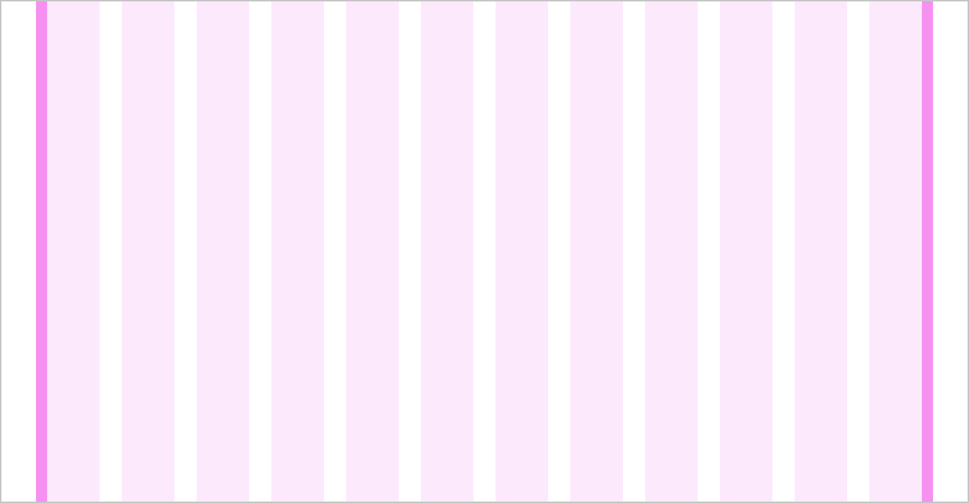
Grid
We use a grid to structure our designs and create consistent spacing. It gives us a flexible way to layout components that adapts to different device sizes.
Guidelines

Columns
The grid has 12 columns. The widths of the columns change with the size of the device.

Gutters
Gutters are the gaps between the columns.
They are:
- fixed to 32px for browser widths above 1300px
- fixed to 16px for browser widths below 1300px
Grid margins
Grid margins make sure there is always white space around the content. The grid margins are 16px wide.
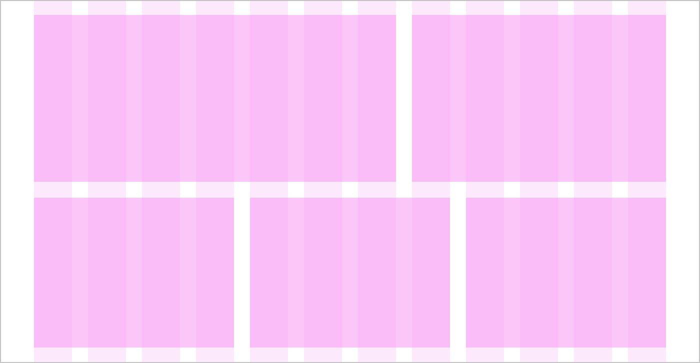
Layout
Components and content can be laid out across as many grid columns as needed.
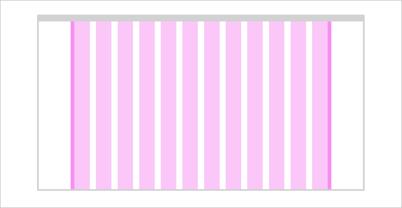
Fixed width grid
The fixed width grid has a container around it that keeps the maximum size centred in the browser at 1440px.
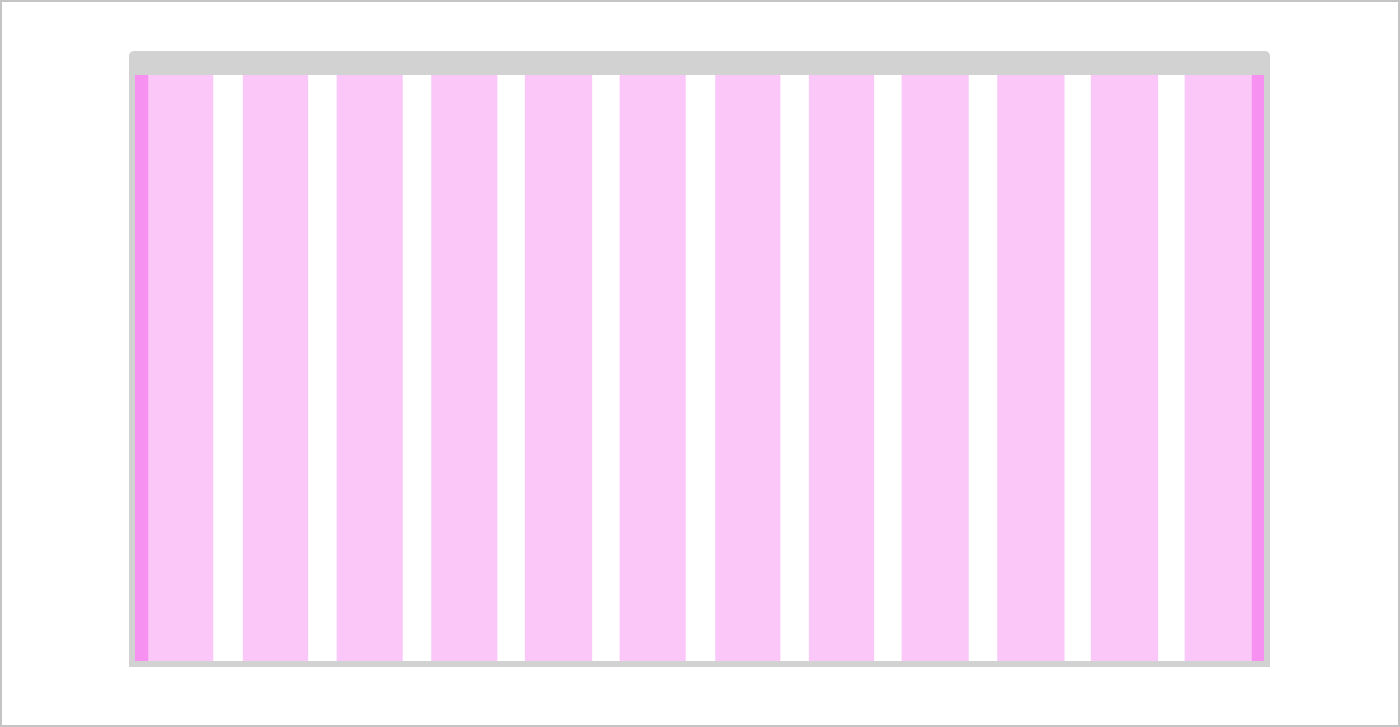
Full width grid
The full width grid allows the content to stretch right to the edges of the browser. This is useful when you’re creating detailed applications that might need to use the whole screen.
| Min width | Breakpoint | Columns | Fixed width grid | Full width grid |
|---|---|---|---|---|
| 320px | xxsmall | 2 | 100% | 100% |
| 414px | xsmall | 2 | 100% | 100% |
| 600px | small | 6 | 100% | 100% |
| 768px | medium | 12 | 100% | 100% |
| 1024px | large | 12 | 100% | 100% |
| 1300px | xlarge | 12 | 100% | 100% |
| 1440px | xxlarge | 12 | 1440px, centred | 100% |
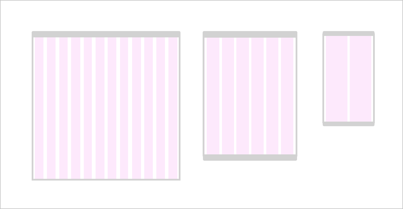
Tablet and mobile grid
With a browser under 600px, the number of columns drops from 12 to 6. With a browser under 414px, the number of columns drops to 2 columns.
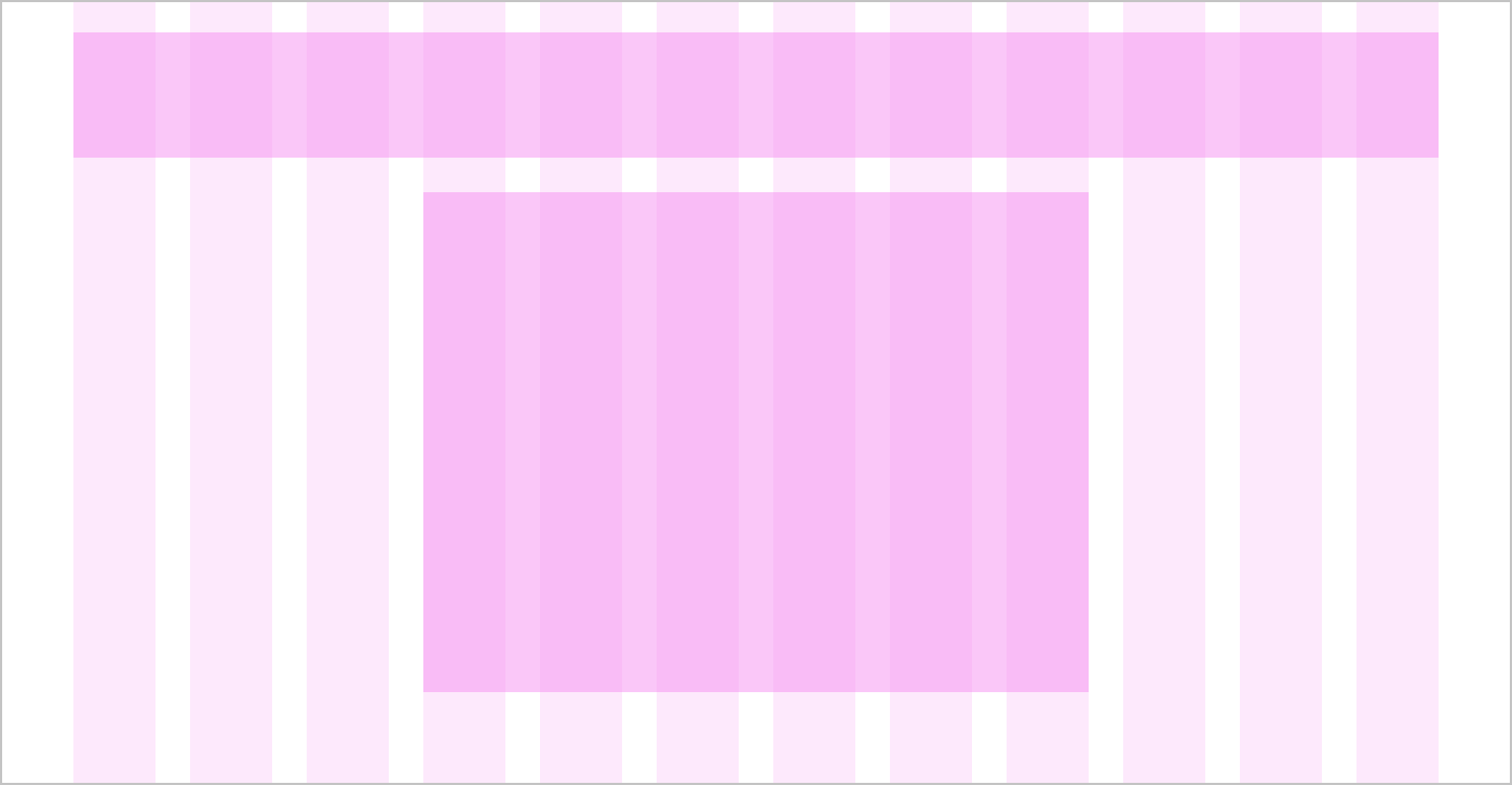
Centering content
Content on the page does not always have to span 12 columns. Components can be centred within a specified amount of columns.
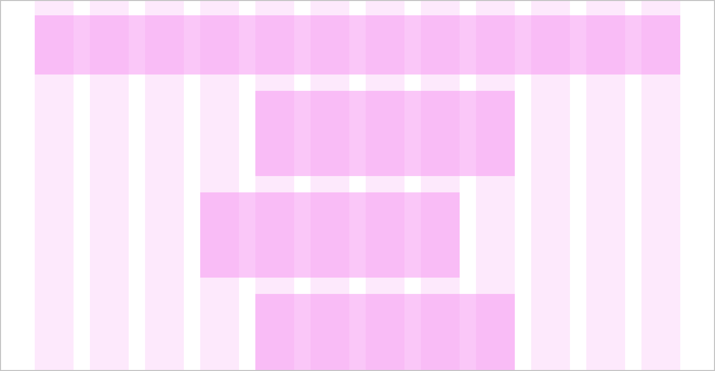
Offsetting content
Content can also be offset by a specified amount of columns. Offset can be changed or removed at different device sizes.
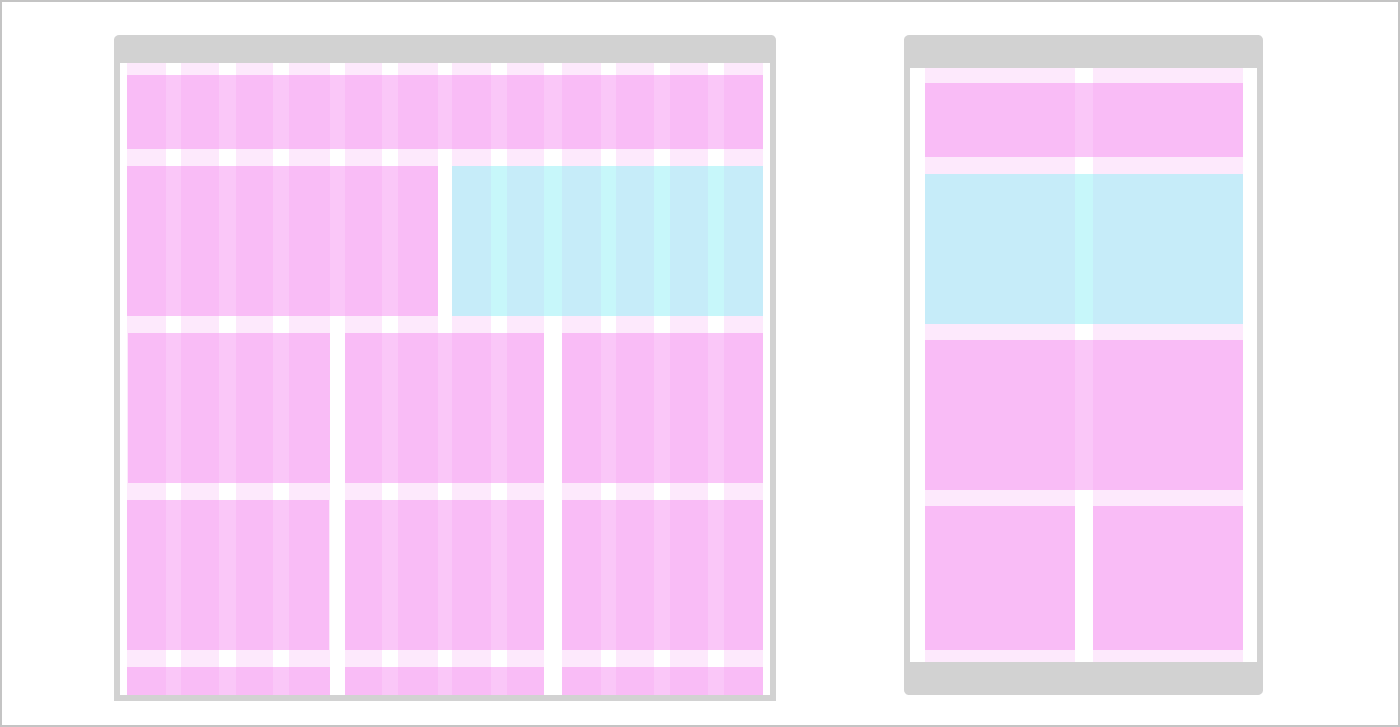
Reversing the order of components on different sizes of device
Components can be re-ordered to change the prominence of content across different device sizes.
Changelog for this page
| Date | Notes |
|---|---|
| 14 April 2021 | First version of page published |