We've launched the Experience Kit version 1
Go to the Experience Kit for React.
Foundations
Spacing
Spacing is the amount of space that we put in place as margins on the page and padding around sections, cards or other objects.
Guidelines
We add space vertically and horizontally when creating components.
We use spacing to create consistency and hierarchy. This makes it easier for people to understand the relationship between different sections of the page.
Our spacing units are multiples from 2px to 64px.
| px | rem | Example |
|---|---|---|
| 2px | 0.125 |  |
| 4px | 0.25 |  |
| 8px | 0.5 |  |
| 16px | 1 |  |
| 32px | 2 |  |
| 64px | 4 |  |
As well as our default spacing units, we also have CSS classes that allow you to experiment with variations of spacing.
You can multiply the 2px, 4px, 8px, 16px, 32px or 64px by either 1.5 or 2.
For example, if your layout requires a large vertical space, you can multiply the 64px unit by 2. This will give you a vertical spacing of 128px.
The CSS classes that support this already exist. If you’re unsure, ask the engineers on your team to talk you through them.
Horizontal spacing is managed by the gutters that appear between columns in our grid. Above a width of 1300px (for devices like laptops and desktops) these are 32px and below (for devices like tablet and mobile) they are 16px.
For more on horizontal spacing go to the grid page
Horizontal spacing
Horizontal spacing is managed by the default gutters that appear between columns in our grid. Above a width of 1300px (for devices like laptops and desktops) these are 32px and below (for devices like tablet and mobile) they are 16px.
For more on horizontal spacing go to the grid page.
Example
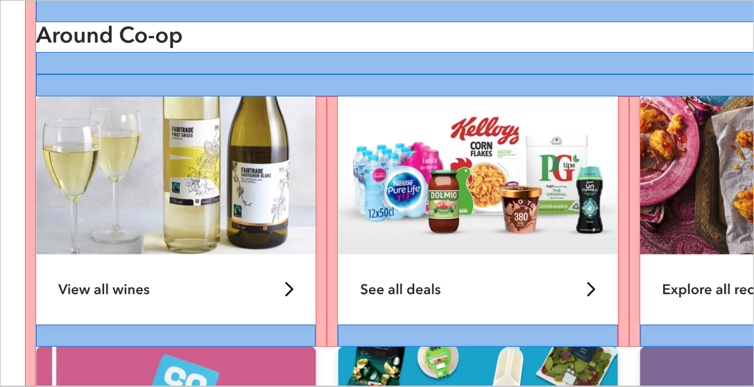
Example showing some of our 16px and 32px spacing in use.
Changelog for this page
| Date | Notes |
|---|---|
| 14 April 2021 | First version of page published |