We've launched the Experience Kit version 1
Go to the Experience Kit for React.
Components
Hero banner
Use the hero banner to create an area at the top of a page that introduces the content.
Guidelines
The hero banner will often be the first thing a person reads or engages with on the page.
Use a descriptive page title to tell people what the page is about and what they can find there. You can also include some introduction text, call to action buttons, links and an image.
Example
Supporting communities
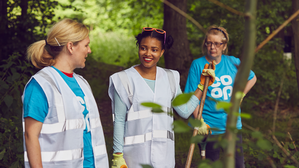
Find out what community and the power of local people means to Co-op. You'll discover the great things we can achieve when we work together to create a better society.
A hero banner with an image, background colour and button.
Required elements
Page heading
It should be:
- descriptive of what will be on the page
- black or white depending on the background colour
Introduction paragraph
This should support the page heading as a brief summary of what people can expect to find on the page.
It should:
- help the user decide if they are in the right place for what they need to do or find out
- be the same colour as the page heading (either black or white)
Background colour
Add a background colour that reflects the tone of the product or service.
You can use any colour from the colour palette but make sure that you check the colour contrast.
Example
Supporting communities
Find out what community and the power of local people means to Co-op. You'll discover the great things we can achieve when we work together to create a better society.
A hero banner using a page heading, introduction paragraph and background colour.
Optional elements
Image
The image must relate to the content.
It must have an alt tag that describes the image content. For more information, go to the accessibility standard for alternative text.
If you are creating a hero banner in our content management system Contentful, you should upload a 1200px (width) x 676px (height) image. Contentful will then generate and add the required image sizes.
If you are creating a hero banner using the code, consider image quality across both retina and non-retina devices.
Button
You can add a button to the hero banner to signpost a person to the main action. This should be an action such as making a purchase, using a tool or enquiring about a service.
There are 3 button colours to choose from:
- primary green
- secondary blue
- white
Choose a button colour that stands out against the background colour you have chosen.
Link
You can also add a link. For example, you could provide a link to more detailed information.
The link should be the same colour as the page heading and introductory paragraph (either black or white).
Example
Supporting communities
Find out what community and the power of local people means to Co-op. You'll discover the great things we can achieve when we work together to create a better society.
A link used to highlight further information about the main topic of this page.
End date
Use an end date to display the date a promotion finishes.
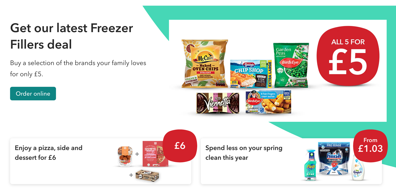
Example
Spicy dinner deals

Treat everyone to a flavour packed Indian meal tonight with our great offers on takeaway favourites you can easily make at home. Choose your rice, sauce and delicious naan or chutney and get ready to spice things up for a low price.
Until 20 October 2020
A hero banner for a food promotion with an end date.
Using a hero banner on a page
Spacing is added under the hero banner by default. If the hero banner has related content (such as products or recipes) this content can be moved up to overlap the background colour.
Example
A hero banner with related content in product cards.
Changelog for this page
| Date | Notes |
|---|---|
| 14 April 2021 | First version of page published |